Friday, 8 May 2015

Finals! and fonts.

The final cover used to have a red band at the top instead of white but, after I changed the double page spread reds font I changed the banner to white.

For the double page spread I have changed the colour of the font as the red font was bugging me and didn't look like it worked well in the end. I also lightened all bubbles and resized the chickens thought bubble.

This is the sheet finished with the same white banner and similarity to the cover title. 


These are the fonts and colours I looked into. I didn't want to hand render anything as my typography is not very strong and would bring the work down. Gloucester MT Extra condensed was the font I went for in the end. I was the only fontI had that matched the posters more than the others. I think the blue and white combo worked the best.

Digital work


These show the progress of the double page spread (the blue wasn't an idea, it was to help me know the sizes of each page and where the fold would be). There aren't any progressions of the cover or worksheet but I have changed colours and moved images around. 

Final designs


This is the final cover. The final title is 'Time to cook: World War 1'


Final double page spread. Containing facts and illustrations of the food.


And this is the final of the worksheet. A colouring sheet with the children and chickens with an extra 'can you find…?' task. Giving the chickens more to do. 


The cover was the hardest to come up with asI find it easier to design a story book cover rather than a recipe book. As I wanted this to have a range of recipes in thought I didn't want to just focus on eggless cake so I had the children carry ingredients and appliances.


Character designs


These are the two characters of the book helping with facts and instructions and keeping the chickens at bay from their food. With boys I have less design though but with girls I have more fun drawing the hair and dresses. I had no real inspiration for my characters it tends to be the typical child I see in my head.

Sketch book sketches

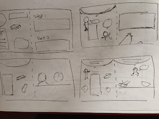
These are my sketches for my book design. There's a few and was hard to come up with one I liked but I managed to pick one. Adding our pet chickens into the book.


 My colour tends to come in once I start doing the work digitally as I can clearly see what colours match with my backgrounds and boarders.


Wednesday, 6 May 2015

more stuff


More research for the style. I found a little recipe book to get an idea of what could be involved onto the front cover. The whale is a type of style I like with lines that aren't very clean and a little rugged.


http://thedesigntabloid.com/2013/07/05/whimsical-illustrator-nicole-long/little-chef-by-nicole-long-ǀ-the-design-tabloid/


I looked at war posters on the internet to see what styles they had the colours they used.
Out of all the posters I decided going with the most recognised poster 'Rosie riveter'
I opted out of the bold yellow but I like the idea of the speech bubble with strong text. Short and simple with no major detail. 

All images I've found on Google